Thursday, October 7, 2010

lift-the-spirits Re-purposing...

I love it when I'm looking for a specific item for a specific purpose and find something else that will work magnificently! Well, see my dilemma below... Welcome to my bathroom counter.  I know, poor Sam! He has no counter space because his adoring wife is a screener! Those of you who went to design school with me know that I can totally function in a world of chaos.  That's what a screener does! I screen-out all of the chaos around me and I can still function in my space.  Well, my husband is a NON-screener, so he can't function so well in a world of chaos, let alone he doesn't have any space on our bathroom counter to function, period! I like to be able to see the things I use on a regular basis (if I can't see where it goes, I most likely won't bother to put it away) and I also like things at an arms reach.
So in my quest for a creative solution... I was perusing through Ikea while chewing on a yummy cinnamon roll and behold! Eureka! My inspiration came from a wine-rack! I have this tall space above my toilet (right next to my counter) and didn't want to put art there because it's below a tall cabinet (funky old house).  I thought this tall, slender wine rack would be perfect!
 So thanks to my handy hunk-a-licious hubby, the wine rack was mounted and put to good use.  Now I don't have a jugle of cords taking over my counter and they're visible and at an arms reach away!
 For all you light-reading bathroom go-ers out there (hey, no shame), you can roll up your magazines and stow them here too! There's a lot you can do with a wine-rack besides storing spirits, and hey, it can lift your spirits too.
 Now all is neatly stowed away and our counter (and Sam) has room to breath!
 So, next time you're trying to organize a space, get a little creative and see the functionality in the items all around you!

Wednesday, April 28, 2010

Kilgore residence: digital design boards

My friends, the Kilgore's, asked me to design some spaces of their brand new home.  Besides selecting the finishes for flooring, walls and kitchen, I've put together the following digital design concepts:

Main Entry no.1: A warm, earth-toned console with room for shoe storage on slanted shelf.  Vibrant glass mosaic candle sconces frame a feminine shaped mirror while a wrought iron coat hanger adds classic, convenient storage.


Main Entry no.2: An Asian inspired console inspired by a place that is near and dear to Mrs. Kilgore's heart which contrasts in shape and color to the vibrant multi-chromed block mirror. Scrolled candle sconces to carry through the scroll of the console table and add a soft curve to the space.  The shelved coat rack adds a convenient place for shoe storage.


Living Room: Using existing sofa and loveseat and incorporating vibrant colors and textural interest.


Key:


Wednesday, January 27, 2010

Webster Residence: Almost done!

Well, the furniture has been upholstered and dropped off! All we have left are the finishing touches like draperies, art and accessories and better lighting conditions for my camera! Below is the "almost done" shot of the front room.  Besides my camera being funny, doesn't it look fabulous?!:

Remember the before?:

Here are the newly upholstered diamond back chairs:

Here's what they looked like before:

Now here is the "almost done" shot of the upstairs craft room. I adore the re-upholstered chair!:

Remember the before shot of the craft room?:


And the chair before:


It's just amazing what a little imagination and hard work can do for an interior space!  I love getting make-overs, I'm sure this old chair just loves me know! I'll post the completely done pictures soon!

Webster Residence: The transformation begins

A good friend to my husband and me, Aaron Hansen, owns a custom cabinet shop called Aaron's Custom Cabinets. I knew I wanted everything to be perfect for the Websters, so I called on Aaron to do the job.  Below are some photos of Aaron (the blonde) and my husband Sam (the tall dark and handsome one (: ) They worked so hard and I just loved the results!  Starting out is a picture of the cabinets almost ready to be installed:


You'll notice that the walls are no longer periwinkle with lemon-zest trim! Now they're an elegant French Country yellow!  Here are the men-folk working hard to make my design look fabulous! (I promise Sam is helping- I think it's called "quality assurance")


Now you'll see the guys up in the wall niche in the Front room.  Well, first I'll show you a before shot because I forgot to put on in my last post:

I wanted this space to be more of a defined space with more interest.  So, I had the guys put up some trim to really set it off.  After they finished, I had the painters come in and paint the trim a crisp, classy white to just barely set off the trim from the wall; subtle yet sophisticated:


Now, remember those corner "columns" I talked about earlier? Well, See below as they are being transformed into elegant structural features thanks to a little moldings and trim pieces (again, a coat of white paint will cover the natural wood tone):

Don't worry- I made them fix the crown molding after I took this picture, it's a little crooked here ;)

Webster Residence: the "before" shots

The Websters are a wonderful family in my neighborhood.  Mr. Webster told me that he'd love for me to meet up with Mrs. Webster about re-upholstering some furniture pieces.  Mrs. Webster was beyond thrilled that her husband suggested that I swing by for a consultation.  As it turns out, Mrs. Webster inherited quite a few great pieces from her mother when she passed away.  I knew these pieces meant a lot to her and I knew we could breath some life into them to make them fabulous all over again! After we got to talking, we decided we could do more than just re-upholster.  We decided to paint the walls in the front section of the house and up into the hallway and into 3 rooms upstairs.  She also decided that she wanted to re-carpet those areas as well as add a built-in work area in one of the rooms upstairs.  We aren't quite done with draperies and accessories, and the light wasn't doing so well for my camera, but the Webster's and I are THRILLED with the results thus far.  See below the progress of the Webster residence transformation; beginning here with a fabulous old chair that needed a facelift:


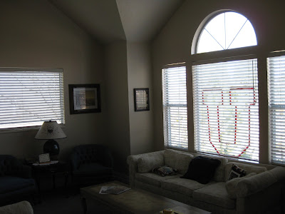
Below is the before picture of the front room.  I love the architectural elment of the corner "columns".  You'll see what I did with them in a few pictures below. You'll also see the sofas in their "before" state as well as the old carpet and window treatments (yes- they're U fans- my apologies to my husband and our Y fans friends!):

A better look at the sofa:

And a better look at one of the set of 4 diamond back chairs:

As I mentioned before, Mrs. Webster wanted to change some things in the upstairs rooms as well.  One of the rooms she wanted to change the most was her craft room.  In its "before" state, it was a rather colorful and bright children's sort of themed room.  However, Mrs. Webster wanted to have this be a special room tailored just for her while she crafts and scrapbooks her heart out! 


As soon as we were done meeting, I rushed home and started ideating (a term for brain-storming we used in design school) Below are some of my layouts and elevations I presented to Mrs. Webster: Starting with the proposed layout for her front room:

And an elevation for those wonderful corner "columns".  I wanted to trim them out and accentuate what wonderful architectural elements they are! They make that particular part of the room feel cozy and special:

Now, upstairs she wanted built-in cabinetry and a desk, for her every crafting whim.  This is what I came up with for a layout:


And elevations showing cabinetry details; starting off with the West wall with lots of cubbies and storage:


The South wall as if you're in the room looking toward the door:

And lastly the North wall as if you're standing at the door, looking toward the window-seat.  I love the bead-board panel details!


Design Board- Legacy Village- Taylorsville, UT

One of my most recent projects was in the Senior Living Sector.  I did a design for a huge Senior Living/Rehabilitation Center for Legacy Village in Taylorsville, UT.  My clients at Western States Lodging were amazing to work with! Below is a small design board I did for the patient areas: common rooms and private rooms.  I'll have some photos up soon as well:


Photos: Elements Restaurant- Logan, UT

One of my most recent Hospitality designs was for the Elements Restaurant in Logan, UT.  Interestingly enough, I found out from my Aunt that the restaurant is built on the same land as my Great-Grandfather Henry Olaf Nelson's business once stood.  Talk about getting to your roots!


Below is a photo of the main dining room.  My favorite feature is the 3-form suspended roof panels I designed:


Here you'll see the bar area:


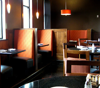
And the booths in the bar:


Here is a nice cozy banquett seating area, perfect for a fun gathering:

And last, but not least, my favorite booths to sit in and enjoy a night out with my sweetheart!  I loved the wall-vinyl I found for this area- dramatic bold pattern, subtle tone-on-tone shade
(I LOVE Patty Madden ):